Search

How Herringbone Flooring Adds Instant Luxury Without Overdesigning Your Space

Sometimes, luxury interiors require less.
More dramatic features.

In some cases, one strong design decision will be enough for any room.

But more and more, that’s the bottom line.

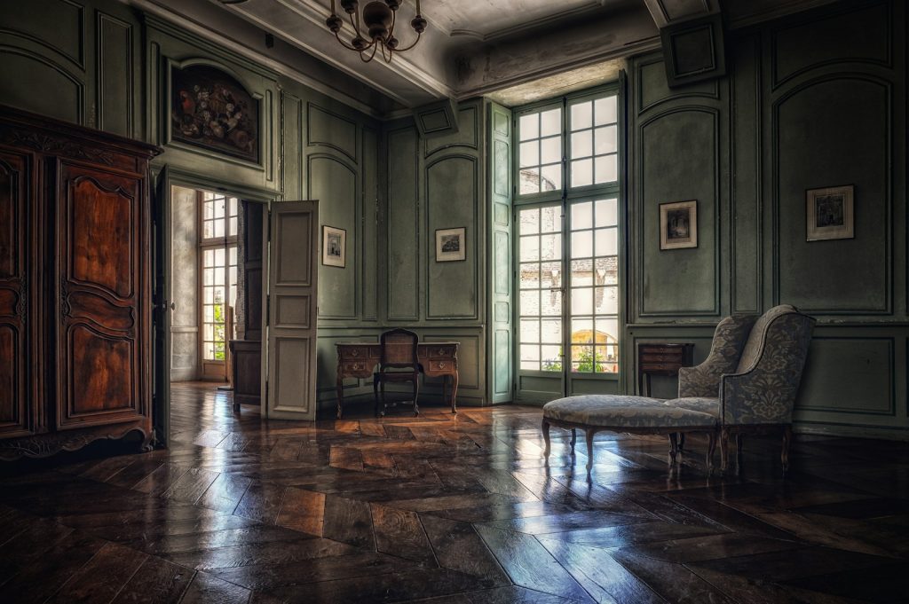
Herringbone flooring is one of the most classic designs out there and can help to add a level of sophistication to any space without overdoing it. A zig-zag pattern repeats throughout the room, providing some movement, texture and architectural interest, yet the rest of the room remains airy.

This is an interesting choice of herringbone for a modern Indian interior. It can lend the grace and beauty of a classic European room to a modern-day apartment, villa, office, boutique or hospitality project, without the museum-like feel.

The Kronotex HERRINGBONE collection embraces this concept and explores it in a very modern fashion with six different oak-inspired décors: D3678 Toulouse Oak, D3861 Pisa Oak, D3773 Silver Oak, D3766 Metz Oak, D3860 Ferrara Oak, and D4766 Calais Oak.

Why Herringbone? Why is Herringbone so luxurious?

The entire thing about Patterned Wooden Flooring is its attention-grabbing effect upon first glance.

Herringbone will give the impression of movement across the room, as opposed to the usual straight-laid plank. With the repetition of the geometry, there is the added depth without the need for the dramatic use of color or extensive furniture.

That’s why the pattern has long been associated with luxurious interiors.

However, take note of the following:

It is possible to make luxury come in without the fuss.

It’s frequently a consequence of selecting one thing and letting it speak for you.

The floor can be that element with herringbone flooring.

The Secret: Let the Floor Be the Statement of the Room

The easiest interior design error in creating a high end interior is attempting to make everything stand out.

Statement sofa.

Statement wall.

Statement lighting.

Statement artwork.

Statement flooring.

All at once, there’s no specialness.

Rather, opt for simple, subdued colors and materials that complement your herringbone flooring.

Herringbone + Neutral Furniture

Complement a warm oak look with:

Cream upholstery

Why is Herringbone so Luxurious?

Natural wood furniture

Soft lighting

Minimal artwork

There’s pattern on the floor and neutral tones throughout the room to keep the space subdued.

Herringbone + Contemporary Furniture

Looking for a more contemporary?

Add the traditional pattern to:

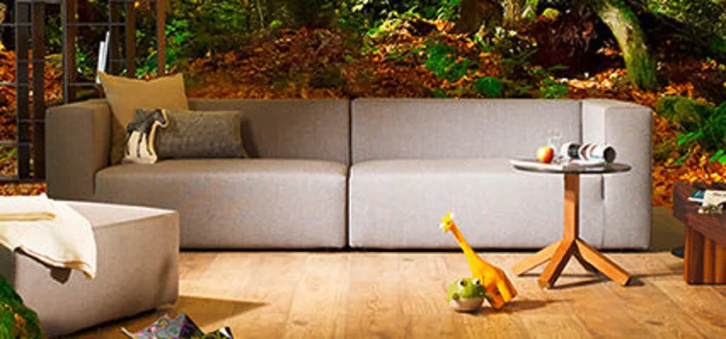
Clean-lined sofas

Black metal accents

Glass tables

Minimal lighting

Contemporary artwork

The traditional floor and contemporary furniture will evoke the old meets new aesthetic.

Why does Kronotex HERRINGBONE Work So Well in Modern Interiors?

Keeping the idea behind the Kronotex collection simple is a great idea:

Vintage as interpreted in contemporary style.

The collection has been inspired by the visual language of historic European interiors, but offered as a contemporary floor solution.

This provides designers the flexibility to design spaces that appear ancient and elegant without being retro.

The six available décors also help to modify the appearance to various colour schemes:

D3678 – Toulouse Oak

D3861 – Pisa Oak

D3773 – Silver Oak

D3766 – Metz Oak

D3860 – Ferrara Oak

D4766 – Calais Oak

Herringbone is not a single design; designers can choose a décor that will match the design of the project.

The 5 Ways to Style Herringbone Without Overdesigning

1. Keep the Wall Decor Quiet

However, it is not always essential to have a patterned wall when the floor is already patterned.

Try:

Warm white

Soft beige

Light grey

Muted earthy shades

This helps to highlight the geometry of the floor.

The result is deliberate, rather than chaotic.

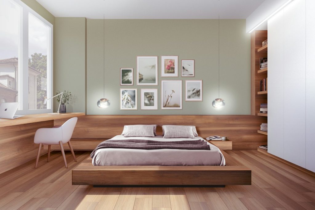
2. Repeat the Wood Tone

A good rule of thumb for creating a professional room design is to repeat the laminate flooring colour elsewhere.

For example:

Herringbone floor, walnut side table and wooden lighting detail

There is a sense of continuity through the repeated wood tones.

It doesn’t have to be an exact match. The only requirement is that there is enough relationship between the components so that the room maintains a sense of unity.

3. Use Rugs Strategically

Herringbone flooring looks great with a rug, but the rug doesn’t have to be large enough to cover the entire floor.

Select a rug that will highlight the pattern and not overpower it.

A large neutral rug under a sofa will provide a comfortable seating area, and the herringbone will still show through.

Consider the floor to be the piece of art and the rug the frame.

5. Avoid Overloading the Furniture

Herringbone is already giving a good rhythm to the design.

For example, rather than trying to pack the room with furniture, leave some room around the furniture.

A simple sofa.

One statement chair.

Clean coffee table.

A select few well-selected accessories.

That’s often enough.

This can be particularly advantageous for Indian apartments with restricted space.

Apply Lighting to Highlight the Pattern

The way a wooden floor appears can be vastly different if it is lit by natural light.

There can be subtle variations across the surface from pendant lights, floor lamps, wall lighting or daylight.

This can help to create a more dimensional geometry throughout the day with a patterned floor.

This is another reason for designers to think about flooring early in the project and not specify it as the end result.

Herringbone Flooring in Indian Homes

Indian house plans feature their own design style.

Wood is used in combination with marble, stone, brass, textiles, artwork, plants and handmade furniture.

The herringbone floor looks surprisingly versatile; that is indeed true.

It plays beautifully with:

Modern Indian

Warm wood, neutral upholstery, brass accents and contemporary Indian artwork.

Minimal Indian

Light wood, white walls, natural fabrics and indoor greenery.

Contemporary Luxury

Shades of wood + marble + metal accents + bold lighting fixtures.

Heritage-Inspired

Wood, traditional furniture, patterned textiles, and antique elements.

The major point is don’t replicate a European interior verbatim.

Take the inspiration. Make it Indian.

Does Herringbone Work in Small Rooms?

Yes—but proportion matters.

In a small room, if everything is busy, a patterned floor can make the space appear more cluttered.

There is no need to exclude the pattern.

Instead:

Lighten the walls.

Select a harmonious colour palette.

Don’t use too many conflicting patterns.

Utilize furniture that has straightforward shapes.

Allow the floor to remain more visible.

In fact, the pattern creates the directional movement which can give character to a smaller room without the need for further décor.

Everyday Performance?

A luxury floor should not only be aesthetically pleasing in a photoshoot, but also look good in everyday life.

It must be functional when people actually live on it!

Children, pets, guests, furniture moving, cleaning, festivities, and much more—all of these are commonplace in Indian homes.

Here comes the reality of performance into play, alongside the looks.

In determining the scratch resistance of a floor, assess the type of activity that the floor will be used for and match the product specification with the intended application.

A beautiful design can become significantly more valuable if it can be used in the daily routines.

Making Installation Simpler

Herringbone patterns can sometimes look complex, leading many to think that installation must be as well.

Not anymore with modern laminate flooring technology.

Click lock flooring systems are created so that the process of joining the flooring is easier than other installation methods, but still requires a certain amount of subfloor preparation and professional installation to achieve the best outcome.

For homeowners and designers, it translates to being able to go with the look and feel of a parquet look with a contemporary flooring format.

Herringbone Doesn’t Have to Mean Traditional

This is probably the number one misconception of the style.

A herringbone pattern isn’t necessarily an outdated flooring choice.

Indeed, it can be a whole point of difference.

Imagine:

Old meets new design with classic herringbone and ultra-modern sofa.

The traditional wood pattern + sculptural lighting.

Modern + Indian style floor and art.

Forever floors + simple design.

The contrast between old and new makes the interior interesting.

And this is exactly where the Kronotex HERRINGBONE collection can fit.

So, when is it best to select a herringbone?

If you are looking for your flooring to:

These are just a few of the advantages of using a chandelier as a focal point in your space.These are just some of the benefits of a chandelier as a focal point in your interior.

For those who prefer a more subdued aesthetic with no visual transition between the planks, a straight plank pattern could be a more suitable option.

However, if you’re looking for the floor to subtly indicate “this space was designed”, herringbone should be part of your list.

Conclusions: Luxury is knowing when to stop

It is not always the case that the very best interiors are the most expensive looking.

They are those where everything seems thought out.

A beautiful sofa.

The right lighting.

A well thought-out colour theme.

As well as a floor that just seamlessly completes the look.

Herringbone flooring provides you with that option.

It brings in pattern, character and heritage without date-ness.

The timeless European-inspired look can be the base for a distinctly modern Indian interior with the Kronotex HERRINGBONE collection.

Sometimes the best design is the one made under all the other designs.
Leave a Reply

Your email address will not be published. Required fields are marked *

Sign up to our Newsletter!

Get all latest news, exclusive deals and updates.
a bed sitting in a bedroom next to a window
Interior Trends

ON-TREND GREIGE INTERIOR

BOSTON CREAM, KRONOTEX MEGA PLUS COLLECTION

This home and living classic is always in demand: the combination of gray and beige to make greige. It’s also reflected in the color scheme for the new KRONOTEX decor Boston Cream. A cement-look floor with timeless beauty and boundless sophistication. The warm interplay of white, beige and gray creates the ultimate in urban lifestyle. The decor exudes freedom and a light feel.

OUR DESIGN TIP

Combine your greige paradise with the it material of 2024: chrome. Use it in decorative objects or with furniture. You’ll love the contrast between cozy warmth and cool elegance!
a bed sitting in a bedroom next to a window
Interior Trends

SOFT AND SUBTLY STUNNING

SALISBURY CHESTNUT DARK, KRONOTEX ROBUSTO COLLECTION

The magic of South England can be found in the new KRONOTEX decor Salisbury Chestnut Dark. It’s as if the spirit of the landscape is captured in this flooring. Soft shapes and warm colors create a balanced elegance. The strong tradition that places like Salisbury exude combines with the beauty of classical flooring in this decor. Warm honey tones combine with creamy cappuccino notes to create an interplay of color full of positive energy. The subtle mix of light and dark reflections is the perfect way to round off the palette.

OUR DESIGN TIP

Combine the Gnarrenburg Oak Brown decor with THE trend color of 2024, Peach Fuzz. The delicate rose pink orange blends wonderfully with the floor’s tones. A sofa or armchair in an on-trend shape inspired by the human silhouette – perhaps in light blue – is the perfect way to complete the look.
a bed sitting in a bedroom next to a window
Interior Trends

MYSTERIOUS AND APPEALING

GNARRENBURG OAK BROWN, KRONOTEX EXQUISIT COLLECTION

The name sounds mysterious – and that’s just what it is. It takes us to the Teufelsmoor in Lower Saxony. That’s where the community of Gnarrenburg sits nestled in the heart of unique protected countryside. Moors harness the powers of nature. They only rarely reveal what’s in their possession. Moors are special and unique. Just like the centuries-old oak from the Teufelsmoor that inspired our Gnarrenburg Oak Brown decor. Peaty brown combines with delicate rose pink in this decor to create a velvety soft look. The floor exudes softness and sensuality.

OUR DESIGN TIP

Combine the Gnarrenburg Oak Brown decor with THE trend color of 2024, Peach Fuzz. The delicate rose pink orange blends wonderfully with the floor’s tones. A sofa or armchair in an on-trend shape inspired by the human silhouette – perhaps in light blue – is the perfect way to complete the look.
a bed sitting in a bedroom next to a window
Interior Trends

PERFECTLY ORCHESTRATED

GUNRAY WALNUT CAPPUCCINO, KRONOTEX EXQUISIT COLLECTION

What does it depend on, the famous wow effect in a room impression? Definitely the courage to reduce and very deliberate, restrained emphasising. Sounds complicated? But it’s not, as our example shows. The perfect blend of warm brown and vanilla milk foam in the Gunray walnut cappuccino decor combines perfectly with the stylishly understated furnishing style. Only the bright yellow armchair seems to draw attention to itself. But in fact, the colours of the room combine in a wonderfully harmonious and flowing way. The floor provides the impressive stage for this perfect setting.

OUR DESIGN TIP

Combine a very light grey instead of white as a wall colour with a discreet use of black. This makes the room appear softer, warmer and more natural. Wood tones and matt gold enhance this elegant look.
a bed sitting in a bedroom next to a window
Interior Trends

MY ISLAND OF ENERGY

BELVEDERE OAK, KRONOTEX EXQUISIT COLLECTION

Treat yourself to your own private source of strength in your home: a room in which green can unfold its full potential. Invigorating, inspiring, vitalising and balancing. For a feeling of strength and vitality like a long walk in the woods. This magical energy perfectly complements the unique structure of the oak wood in the Belvedere Oak decor. Noble light silk grey meets creamy cappuccino brown and makes this flooring a floor with a lot of style!

OUR DESIGN TIP

Your oasis of nature with the Belvedere oak decor is an impressive setting for the bold and trendy retro look with elements from times gone by. Because the tranquillity that your source of strength radiates makes the colourful mix of shapes dance. Dance with us. How about even more vigour with a green smoothie in your Green Zone?
a bed sitting in a bedroom next to a window
Interior Trends

CATCH THE SPRING

BEECH NATURE, KRONOTEX EXQUISIT PLUS COLLECTION

Bring spring into your home with the natural beech decor. The coup: wherever this floor is installed, it’s springtime 365 days a year. The skilful interplay of colours in soft honey gold and amber spreads radiant warmth throughout the room. The extra wide plank of natural beech also creates an atmosphere of spaciousness and openness.

OUR DESIGN TIP

Combine light-coloured walls with a piece of furniture in your favourite spring colour. This highlight is perfectly illuminated by your new floor in natural beech decor.
a bed sitting in a bedroom next to a window
Interior Trends

EVERLASTING LOVE: SCANDINAVIAN STYLE

Few trends have enjoyed such widespread and enduring popularity as this one. It is plain to see why: rooms with Nordic flair have a light and airy, timelessly beautiful and wonderfully laidback feel. Scandinavian living is comfortable and extremely contemporary. The furnishing style is all about wood and nature, with the use of warm textiles to reinforce the effect. The first thing you need for the perfect Scandinavian style is as much white as possible. And a wood-effect floor with a light, warm glow is the perfect way to boost the impact of the white. Add accents of on-trend green and blue to round off your dream of Nordic living in consummate style.
Wooden Flooring Tiles Design

AMERIGO

D 80732 | DYNAMIC

The Amerigo decor brings a light and subtle, matte vanilla tone to the room. Consummate Scandinavian flair for a bright and airy interior.
Wooden Flooring Tiles Design

MOUNTAIN OAK SAND

D 40772 | MAMMUT PLUS

Like warm sunlight, the Mountain Oak Sand decor brings an air of tranquility to a room. Subtle beige blends with a golden shimmer and a natural wood grain on the wide, extralong boards.  
Wooden Flooring Tiles Design

LYBIA OAK NATURE

D 80652 | ROBUSTO

The Lybia Oak Nature decor has a traditional and down-to-earth look. Nut brown and vibrant caramel gold combine in the rustic wood grain. A board to lift the spirits!
a bed sitting in a bedroom next to a window
Interior Trends

THE ART OF PARING BACK

We would be the first to admit that it’s difficult to part with possessions, even if you haven’t used them for a long time. Moving house often offers the opportunity to consider what you really want to keep and how much you actually need in order to feel at home. Interior design is set to focus on the idea of paring back to the essentials in 2023. No-frills wooden and metal furniture features in airy, urban rooms, where the design impact centers, above all, around “absences”. This trend is perfect for combining with our new, natural stone-effect flooring. These styles of decor exude strength and clarity, underlining the consciously pared-back look.
Wooden Flooring Tiles Design

TAVOLO TRAVERTIN WHITE

D 80692 | MEGA PLUS

The stunning Tavolo Travertine White decor pairs bright beige with hints of vibrant light grey. With their subtle natural stone effect, these tiles are the ideal choice for minimalist interior design.
Wooden Flooring Tiles Design

TAVOLO TRAVERTIN GREY

D 80702 | MEGA PLUS

The natural stone-effect Tavolo Travertin Grey decor has a pure, no-frills look. The light grey tiles are the ideal choice for urban-style design and help create a distinctive, loft-like feel.  
a bed sitting in a bedroom next to a window
Interior Trends

PERFECTLY CURATED PATCHWORK

Is your home as colorful as your life? Then it not only suits you to a T, it’s also in tune with one of the megatrends of 2023: eclecticism. A hard one to pronounce? We think so too! That’s why we simply refer to it as a perfectly curated patchwork of beautiful things. A mix of old and new furniture, large prints, treasured finds from your last visit to the flea market. Have the courage to combine all the things that speak to your soul. A neutral floor without an overly strong wood grain can bring a touch of calm to your colorful world. And if you group your treasured pieces together into small collections, you can also create zones to give the eyes a little rest.
Wooden Flooring Tiles Design

AVANTO BEIGE

D 80242 | EXQUISIT PLUS

Light cappuccino brown blends with warm sand tones in the Avanto Beige decor. The extra-wide boards create a snug and inviting atmosphere.
Wooden Flooring Tiles Design

OPAL OAK COFFEE

D 40522 | ROBUSTO

The Opal Oak Coffee decor turns the room into a tranquil haven. The dark essence of coffee blends with light beige tones that lend the board life and luster.
Wooden Flooring Tiles Design

RUBY OAK BROWN

D 40542 | ROBUSTO

The calm, light brown tones of the Ruby Oak Brown decor make it the perfect basis for creating a natural look. A board for a timeless interior.
a bed sitting in a bedroom next to a window
Interior Trends

COLOR FOCUS

Colours influence our sensory perception. Whether consciously or unconsciously, we automatically associate colours with meanings that influence our sensations. In this way, the effects of rooms can be controlled – sometimes calm and serene or energetic and stimulating! Depending on the mood I want to create.
Wooden Flooring Tiles Design

LAVENDER

The trend scouts all agree that lavender is set to dominate our homes in 2023. This delicate, blue-tinged pastel tone can be both calming and fun. On furniture, walls or textiles, lavender creates a perfect balance in the home. And – even better – this serene color is great for combining with other shades. Pair bright, warm floors with lavender, and bask in the glow of a summer’s day in Provence. Or opt for more low-key, grey flooring with lavender to create an oasis of balance and calm. Unleash your creativity!  

BODEGA OAK NATURE

D 40432 | EXQUISIT PLUS

Caramel brown and golden sand tones combine in the Bodega Oak Nature decor to create a warm glow. An even grain adds to the charm of these extra-wide boards.
Wooden Flooring Tiles Design

FRESH GREEN AND BLUE

A bold and enigmatic color trend for 2023: the combination of blue and green. Nostalgic, emotional and audacious. And at the same time, an ode to nature, to water, to the sky and to plant life. Colors that are redolent of vitality. Green and blue help improve concentration and have a calming effect. The strong hues are excellent for combining with our new flooring options in grey and pink tones.  

AVANTO NATURE

D 80272 | EXQUISIT PLUS

The Avanto Naturale decor features a rustic mix of light and dark brown tones. The extra-wide boards bring a touch of country-house living to the room.
Wooden Flooring Tiles Design

WE ARE SEEING RED!

The trend color red is set to lift our spirits in 2023. Earthy red tones will define home interiors, bringing a glow of energy and life. Ready for something new? Don’t be afraid to go for a color that sends signals! Red is available in a rich variety of shades, so you can mix and match them in any number of ways. You can combine the red tones in your room with light or dark flooring, depending on the effect you want to achieve.  

AVANTO LIGHT

D 80262 | EXQUISIT PLUS

Soft vanilla, warm sand and a hint of nougat brown make the Avanto Light decor the ideal choice for a natural, Scandinavian look. Extra-wide boards for a snug, warm interior.
a bed sitting in a bedroom next to a window
Interior Trends

SUSTAINABLE AND ORGANIC

This on-trend look for your home is all about mindfulness and being close to nature. Home accessories for 2023 focus on natural materials such as shells and stones, and on making conscious use of resources. Neutral colors harmoniously underpin the design and are ideal for combining with wood tones. Something that looks particularly good here is an old cupboard that has been given a limewash finish.
Wooden Flooring Tiles Design

BODEGA OAK BEIGE

D 40402 EXQUISIT PLUS

The light, warm sand tones of the Bodega Oak Beige decor bring a glow to the room. The extra-wide boards have a natural, light wood grain that makes the play of colors all the more effective.
Wooden Flooring Tiles Design

BODEGA OAK GREY

D 40412 | EXQUISIT PLUS

The Bodega Oak Grey decor exudes an air of restraint and balance with its grey-brown color and subtle touches of vanilla. An extra-wide board for rooms that demand a strong, enduring look.

Sustainability

Dedicated to the ethos of sustainable practices, the SWISS KRONO Group, a guiding force behind Kronotex India, is unwavering in its commitment to defined sustainability criteria. Across all its divisions, the group prioritizes the efficient and sustainable use of wood as a natural resource, ensuring the protection of invaluable resources. Embracing a circular economy, recycled wood is integrated where quality remains uncompromised. Further emphasizing its commitment, the group harnesses renewable sources to generate a substantial portion of its energy needs. Kronotex India echoes this commitment to sustainability, offering not just flooring solutions but a pledge to uphold eco-friendly practices, mirroring the SWISS KRONO Group’s values while ensuring quality in every plank.

CO2

Embracing a vision of sustainability, Kronotex India, inspired by the esteemed SWISS KRONO Group, aligns itself with the principles of resource conservation and energy efficiency. SWISS KRONO Switzerland, throughout its value chain, prioritizes energy-efficient manufacturing, with over 90 percent of thermal energy sourced from renewables, ensuring a climate-neutral production process.Since 2010, a robust energy management system has been in operation, focusing on efficiency enhancement and CO2 emission reduction by substituting fossil fuels. The commitment extends beyond words to actions, with continuous adaptation of infrastructure and optimization of processes. This unwavering dedication is not just a corporate ethos; it’s a significant contribution to the national goal of curbing greenhouse gas emissions for a healthier climate. 

Cascading

Our approach extends beyond efficient production; it encompasses the entire lifecycle of our products. From conscientious product planning and sustainable raw material procurement to environmentally compatible production processes and logistics, we are committed to minimizing our ecological footprint. Through cascading the use of wood, we actively contribute to CO2 reduction, employing cutting-edge technologies to recycle raw materials to the fullest extent. At SWISS KRONO Switzerland, even what cannot be directly used in products finds purpose through optimal recycling, shaping a sustainable wood cycle. Kronotex India: where sustainability is not just a practice but a pledge to harmonize with nature.

CH80

At Kronotex India, the essence of “Swissness” is woven into the fabric of our identity, drawing inspiration from the distinguished CH80 initiative of SWISS KRONO. Our commitment echoes the Swiss ethos, where approximately 80 percent of raw materials and value-added processes remain rooted in Switzerland. While our manufacturing hub is overseas, the spirit of “swiss made” permeates every product we offer. 

Sustainability is the cornerstone of our production philosophy. We actively participate in the thinning and rejuvenation of Swiss forests, supporting local businesses and minimizing transport distances. This holistic approach aligns with our dedication to sustainable practices, serving as an asset for both humanity and nature.